top of page
Taichung Metro Rebranding
Infusing a fresh new image into the metro system of Taiwan's second largest city.
2020
BRANDING
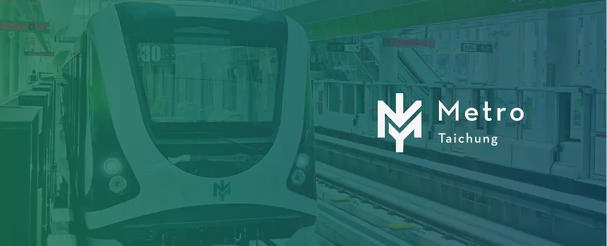
The Taichung Metro is the rapid transit system in the second largest Taiwan city Taichung. The first Line Green was completed in 2020.
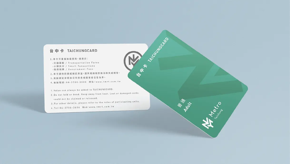
The inspiration of this logo is based on Chinese "中" and incorporates the MRT abbreviation "M".
The blue in the visual identity symbolizes the ocean, while the green represents the mountains, commemorating Taichung as a city born from the nurturing embrace of both.


Personal Project: Identity System Not Utilized in Practice
bottom of page